The title of the post says it all. Using only the teams in the playoffs and the actual matchups, here is who I think would win the best trophy in sports if it was decided entirely on their uniforms.
Click on the links to see the jersey (in action no less!) and toss in your two cents as to who's uni is the coolest. The home teams will be in their home threads, while the away teams will be wearing the traveling uniforms.
WESTERN CONFERENCE QUARTER FINALS
#1 San Jose Sharks vs. #8 Anaheim Ducks
Teel, black, and gold trim easily take care of Anaheim's fashion fopaux.
#2 Detroit Red Wings vs. #7 Columbus Blue Jackets
The flying-wheel logo and royal red intimidate the patriot-themed uni of Columbus.
#3 Vancouver Canucks vs. #6 St. Louis Blues
In a battle of ugly uniforms, St. Louis comes out on top, thanks in large part to the iconic logo.
#4 Chicago Blackhawks vs. #5 Calgary Flames
A flaming "C" is no match for the home jersey's of the Chicago Blackhawks, and the indian-head logo march on into semifinals.
WESTERN CONFERENCE SEMIFINALS
#1 San Jose Sharks vs. #4 Chicago Blackhawks
The away-jersey of the Blackhawks doesn't pack the same 'umph' as the home-reds. Plus, the Sharks can break out this ominous all-black alternate if they so please, giving them an edge and shot at the Western Conference title.
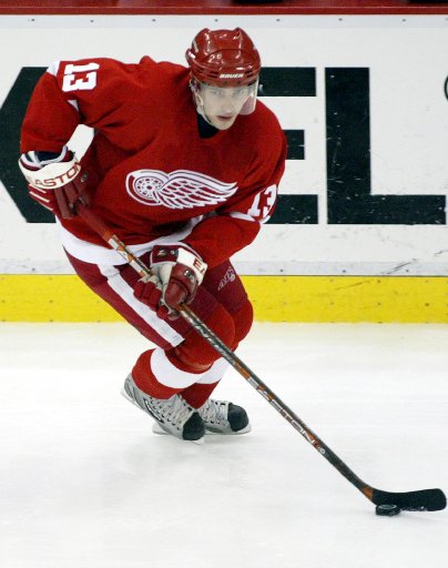
#2 Detroit Red Wings vs. # 6 St. Louis Blues
St. Louis barely squeaked by in the first round. They are no match Detroit, and the winged wheel cruises into the finals.
WESTERN CONFERENCE FINALS
#1 San Jose Sharks vs. Detroit Red Wings
I don't why, but I like the Shark's jerseys. The teel with black and gold trim, the all black, and even this one . Thanks to their number one seed, the Sharks have home-ice advantage throughout the playoffs, giving them more oppurtunities to bust out one of three neato home jerseys. The Sharks advance over the ho-hum whites of the Detroit Red Wings. Not even Detroit's throwbacks could have saved their playoff hopes.
EASTERN CONFERENCE QUARTERFINALS
#1 Boston Bruins vs. #8 Montreal Canadiens
Original Six rivals, two classic logos, this matchup has it all. But the black and gold of Boston elimates the roughe, blanc, and bleu of the Monteal Canadiens.
#2 Washington Capitals vs. #7 New York Rangers
An ugly jersey from the District cannot hold it's own against a classic Rangers uni. Rangers move on.
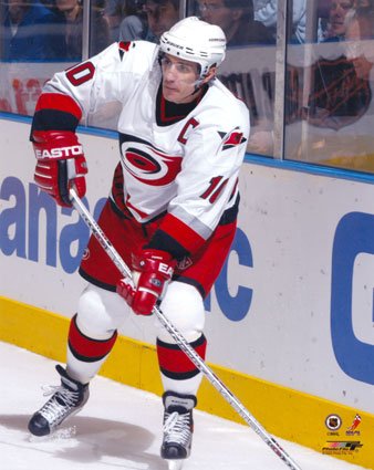
#3 New Jersey Devils vs. #6Carolina Hurricanes
Who does a better job of implementing red, black, and white? New Jersey. Plus, the logo is way cooler.
#4 Pittsburgh Penguins vs. #5 Philadelphia Flyers
When the Penguins can sport this throwback at home games, how can they lose? Even against the Flying "P" of Philadelphia, Pittsburgh gets the nod. And the Flyers jersey looks like Halloween anyway.
EASTERN CONFERENCE SEMIFINALS
#1 Boston Bruins vs. #4 Pittsburgh Penguins
In a battle of my favorite uniform colors, Boston comes the winner. Even if Boston decided to wear their alternate, they still win. Sorry Pittsburgh, you would have won had you worn the 1991 away unis.
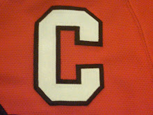
#3 New Jersey Devils vs. #7 New York Rangers
A tough choice, but New York pulls out yet another upset. New Jersey should be happy about making it this far though, they would have been knocked out in the first had they worn these Christmas-themed monstrosities.
EASTERN CONFERENCE FINALS
#1 Boston Bruins vs. #7 New York Rangers
Ahh yes, yet another installment of the New York-Boston rivalry. Once again, home-ice plays a large part in deciding the victor, and the black and gold, block letter "B" means curtains for New York's surprising run to the conference finals.
STANLEY CUP FINALS
#1 San Jose Sharks vs. #1 Boston Bruins
The Original Six-ness of the Bruins jersey, along with the totally rad color scheme, help them win their first Stanley Cup since 1972.
Subscribe to:
Post Comments (Atom)
No comments:
Post a Comment